
( – promoted by buhdydharma )
Burning the Midnight Oil for Living Energy Independence
 A few weeks back, SubsidyScope, “launched by The Pew Charitable Trusts, aims to raise public awareness about the role of federal subsidies in the economy”, pursued its mandate into transport subsidies, coming out with a study with the headline figure of $32 subsidy per passenger for Amtrak.
Why Amtrak? Why not provide a headline figure on federal subsidy per motorist or airplane passenger? Critics of the report suggest that the answer is simple – consider, for instance, Charleston WV mayor Danny Jones:
Jones admits Amtrak relies heavily on subsidies, but so do other modes of transportation, he said.
“I think it’s just easier to see how much of it’s subsidized with Amtrak,” he said.
And there is a lot of merit in that. Further, SubsidyScope is not focusing on Government subsidy, but on Federal subsidy. Not only is it harder to analyze government subsidies to driving and flying, given how many direct and indirect subsidies there are to take into account – but many of the subsidies are at the state and local government level, so for SubsidyScope’s purposes they “don’t count”.
But its worse that that. Even accepting SubsidyScope’s twisted framing of the issue of government subsidies – the actual core part of the analysis that they themselves perform is hopelessly bad. The gory details, and then the numbers that pity forced me to rescue from the clutches of SubsidyScope, below the fold.
A Very Very Very Bad Excuse for Capital Cost Analysis
Even granting the grossly flawed mandate of looking at government subsidy without considering social benefit and of looking at only the Federal portion of that subsidy – SubsidyScope’s analysis have a further glaring flaw, in that they do an entirely static analysis. This was pointed out shortly after the release of the study by Robert Cruickshank at the California HSR blog in his post of 27 October, 2009, How Much Per Driver Did US Freeways Lose?:
The number one flaw of the Pew report, by far, is it does not compare 2008 numbers to previous years. The report merely examines Amtrak route performance in 2008 alone. As you all remember, 2008 was a rather interesting year for American transportation. Most passenger trains – from Amtrak to the local subways and streetcars – experienced significant spikes in ridership as a result of the spike in gas prices.
Any study of 2008 passenger rail that does not take into account these effects is not credible. At all. And a study that doesn’t even compare to past years is a joke.
Robert Cruickshank uses information from the Capital Corridor Joint Power Authority to show that even before the spike in ridership due to the Oil Price Shock in 2008, a 100% increase in state subsidy over the past decade has been met by a 269% increase in ridership, with four times the number of trains and the state subsidy per passenger mile dropping from $0.33 to $0.18.
 Of course, the SubsidyScope analysis further confuses the issue by headlining subsidy per passenger, rather than subsidy per passenger-mile. This is, of course, absurd: it treats trips from Harrisburg to Philadelphia, from Washington DC to New York, and from Chicago to Seattle as each delivering identical “travel” benefit.
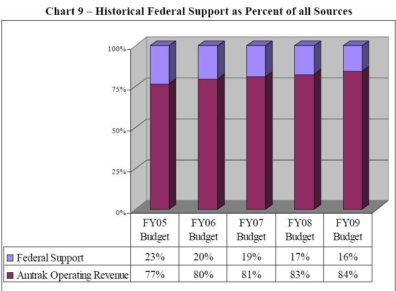
Indeed, Amtrak’s figures themselves (p. 11, right) reveal that Federal subsidies are a declining share of Amtrak revenue.
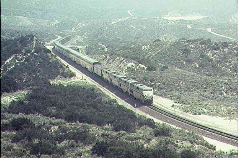
Focusing on the Amtrak Routes
SubsidyScope extends its analysis to routes by by taking Amtrak figures on route performance, and then allocating costs that are not allocated by Amtrak to the routes, with a principle cost being depreciation.
The way that Subsidyscope does this is by working out the total unallocated costs, dividing by the number of passengers, and subtracting those from the per passenger profit/loss derived from Amtrak route information.
That is, if one passenger travels from Chicago to Fargo, North Dakota, Mayor Jones travels from Charleston WV to Chicago, and a third passenger travels from Providence, Rhode Island to Boston, each of them are considered to be participating in the same depreciation of Amtrak equipment and right of way.
This is, of course, absurd. Some services run in Amtrak corridors, others run in private railroad corridors paying an access fee. Charging depreciation of the Amtrak owned corridor to the passenger where the access fee is included in operating costs is obviously absurd. Charging the same depreciation of Amtrak trains to the passenger between Providence and Boston and the passenger between Chicago and Fargo is just as absurd.
Considering passenger miles instead of just passenger counts is better – indeed, it may be the most reasonable rough estimate for depreciation of Amtrak trains. But it still suffers from the problem of counting the access fee paid to operate on private rail corridors, and then allocating the corridor a share in the depreciation of the rail corridor owned by Amtrak.
Clearly SubsidyScope’s analysis is grossly and obviously biased against those routes that run in private corridors and in favor of those that run on Amtrak-owned corridors. It makes a mockery of any pretense of SubsidyScope that it is analyzing the “profit and loss” of specific routes when it makes these capital adjustments.
Indeed, one wonders whether there is an ulterior motive in this gross analytical mistake. For any going concern with some business lines relying on its own infrastructure and others relying on paying access fees for infrastructure owned by someone else – just spreading depreciation uniformly between the different business lines is either gross incompetence or an effort at deliberate deception.
Not having any information to the contrary, I will make the charitable assumption, and presume that SubsidyScope is merely being lazy and grossly incompetent in their adjustment for depreciation.
Whether ascribed to incompetence or to malice, Subsidyscope’s analysis is clearly useless for improving our understanding of rail capital cost issues. However, this does not mean the analysis is entirely useless. They do collect the Amtrak route information on operating revenue per corridor and match it up with profit/loss per corridor prior to engaging in their absurd gymnastics in allocating depreciation.
That means that they have collected information that can be used to infer operating recovery ratios by route – that is, the ratio of operating revenues to operating costs (Amtrak’s “operating ratio” is cost/revenue, rather than revenue/cost).
Pity the poor numbers, they didn’t make SubsidyScope do it
So this is a boring old data report posting. I earnestly apologize for that, but after grasping what a hatchet job SubsidyScope did in terms of their reporting on profit/loss on a per line basis, I just had to go in and see what I could do to recover some information from their shambles.
With respect to operating recovery, there is one flaw inherited from the slanted frame within which SubsidyScope operates. Since they ignore state and local subsidies, that means they treat state subsidies for state-subsidized services as part of revenues. For purposes of computing operating ratios, they should be excluded.
Now, I am going to do something similar to what I have just blasted SubsidyScope for doing, and do a simple pro-rata allocation of the total state subsidy share of state corridor route revenues to each state corridor route. In my defense, I will say:
- first, I know this is less than ideal, while SubsidyScope writes up a much more egregious pro-rata allocation as if it gives a precise answer;
- second, if anyone has the specific subsidies on a specific corridor, I will happily enter it into that corridor, and adjust the balance of pro-rata shares to reflect that; and,
- I am doing this analysis for free on a couple of Sunday afternoons, while someone got paid to make this kind of rough, back of the envelope calculation for SubsidyScope
If you are looking for something over and above looking at the operating ratios that I have rescued from SubsidyScope’s numbers abuse – well, I hope you have already found it. The balance of this post is just a glance at these numbers.
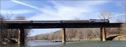
 The Northeast Corridor
The Northeast Corridor trains stand on their own. Of course, when running on track owned by Amtrak, access fees will be lower – and at the same time, this is where the bulk of capital depreciation on corridor infrastructure itself will be located. Still, according to SubsidyScope’s figures, the entire Northeast Corridor yields an operating surplus.
There is a temptation here to say, “well, so conventional rail is hopeless, but even the only-barely-HSR of the NEC changes that”. But if we lapse into all-or-nothing thinking in the face of a range of operating results, we are going to be blind ourselves to ways to leverage a broader range of more energy independent transport.
The tables are set up with routes with operating recovery ratios at or above the total for the group in the left hand column, and those below the group’s operating recovery ratio in the right hand column.
| Northeast Corridor | Op Ratio | Northeast Corridor | Op Ratio |
| NEC Overall | 158% | ||
| Acela | 183% | NE Regional | 139% |
 The State Corridor and State-Subsidized Routes
Corridor trains include the largest number of services that are eligible for direct replacement with an Emerging/Regional HSR service, as well as services that can be started relatively early in the development of the Steel Interstate system.
The most striking feature that emerges from SubsidyScope’s information is the cluster of corridor service that are in the neighborhood of 60% operating recovery. A package of structural improvements – and, obviously improving effective trip speed will be a critical improvement – that can bring a “typical” corridor service from 60% to 100% operating recovery would bring the majority of routes and the corridor services as a whole into or close to an operating surplus.
The reasons for setting up the table into columns relative to the average for the group is for exploring the factors that help explain operating ratio. The table can be split in terms of above and below average length, or frequency, or population per route mile, or population per hour, or average on-time performance, and it can be seen at a glance when a factor tends lines up with the operating ratios. But that analysis will wait for some later set of Sunday afternoons.
While the average operating ratio for the State Corridor trains is not affected, bear in mind that the following involves a pro-rata distribution of state operating subsidies.
| Corridor Route | Op Ratio | Corridor Route | Op Ratio |
| Corridor Services | 58% | ||
| Chicago-St. Louis IL/MO | 79% | Blue Water MI/IL | 55% |
| Newport News DC/VA | 77% | Zephyr IL | 54% |
| Carolinian NY/NC | 71% | Vermonter VT/DC | 54% |
| Illinois-Saluki IL | 70% | Albany-Toronto NY/ONT | 54% |
| Adirondock NY/Quebec | 69% | Capital CA | 53% |
| Heartland TX/OK | 67% | Piedmont NC | 52% |
| Hiawatha IL/WI | 66% | Empire NY | 48% |
| Ethan Allen NY/VT | 65% | Missouri River MO | 45% |
| Downeaster ME/MA | 64% | Pennsylvanian PA/NY | 43% |
| San Jaoquins CA | 61% | Wolverine MI/IL | 39% |
| Keystone PA | 61% | Springfield Shuttle MA/CT | 32% |
| Cascades OR/BC | 61% | Hoisier State IN/IL | 15% |
| Pere Marquette MI/IL | 59% | ||
| Pacific Surfliner CA | 59% |
 The Long Distance Services
The long distance services are the ones that can gain the most converting the Strategic Rail Corridor Network into a network of Steel Interstates. Faster and more reliable Electric Rapid Rail service might be more important in terms of reducing cost per mile as in increasing ridership. Wages and salaries are 54% of long distance operating costs, and wages are paid per hour, not per mile – the faster the trip speed, the lower the labor cost per mile. And fuel and utilities is another 17% of operating costs, where electricity is less expensive on an equal-energy basis and electric locomotives are more energy efficient.
The Auto Train stands head and shoulders above the typical long distance route in terms of operating recovery, and would seem likely to have an operating surplus if run on a Steel Interstate.
Of course, our two main long distance transport systems run on operating subsidies, so that it would be biased to expect that long distance trains ought to break even when cars and planes are not expected too. However, even if we expect to continue subsidizing these operations, raising the operating recovery ratios allows us to leverage more transport service with the same level of subsidy. That is, consider a service operating on the basis of 40% service revenue, 60% subsidy. If that same amount of subsidy is maintained, then in terms of operating costs alone:
- 50% operating recovery allows 1.2 times as much service
- 60% operating recovery allows 1.5 times as much service
- 70% operating recovery allows 2 times as much service
- 80% operating recovery allows 3 times as much service
- 90% operating recovery allows 6 times as much service
I am not sure what combination of fuel prices and service improvements are required to get these services up to operating break-even – or even whether we ought to be targeting operating break-even. However, it seems quite likely that the operations on a Steel Interstate system would allow the majority of the routes below to get into the range of 70% operating recovery.
| Long Distance Route | Op Ratio | Long Distance Route | Op Ratio |
| Long Distance | 49% | ||
| Auto Train VA/FL | 85% | Silver Meteor NY/FL | 47% |
| Empire Builder | 61% | Capital Ltd DC/IL | 45% |
| Palmetto NY/GA | 55% | Coast Starlight WA/CA | 45% |
| SW Chief IL/CA | 49% | Crescent NY/LA | 44% |
| City of New Orleans IL/LA | 49% | Texas Eagle IL/TX | 43% |
| CA Zephyr IL/CA | 43% | ||
| Silver Star NY/FL | 41% | ||
| Lake Shore Ltd MA|NY/IL | 41% | ||
| Cardinal DC/IL | 34% | ||
| Sunset Ltd LA/CA | 23% |
Conclusions
I have few conclusions, other than dismay that Pew would finance work like the work that SubsidyScope has turned out without demanding its money back. However, I do expect that I will be able to take these tables and find the key factors that tend to drive operating recovery up toward the direction of operating break-even.
Midnight Oil – River Runs Red
Unauthorized Protest Concert at Exxon HQ
9 comments
Skip to comment form
Author
… unless I didn’t hear verse right.
America’s love affair with the auto, the culture that grew up around it and maybe event the collective auto industry’s destruction of the railroad industry is relevant. I still wonder if Dr. Moray or Nicola Tesla drove an electric car in 1930 or did Charles Nelson Pogue patent a workable 100 mpg carburator years ago. Did the auto industry buy then bury the 1955 hydrogen powered car.
Then again I could be wasting my time echoing false echos to my NSA assholes in homeboy security bunker room 4591A. Their computer is talking to my computer.
May you excuse my cynical attitude but here in America we end up subsidizing the tasering of grandma and the corporate ownership of my wife, who is the only person employed in my household. I don’t think recovery of any sort is planned for this piece of real estate.
good work. I just dropped a Rec on it over at Kos’ place. Not that it’ll do much good today, with all the hyperventilating over health stuff that’s going on.