
The Federal Reserve Bank of Dallas has posted a very illustrative discussion of the current recession on their website, and for readers confused by the simultaneous decline in jobs and the official measure of unemployment, 20,000 fewer jobs while “unemployment” declined from 10% to 9.7%, one picture may be more informative than so many curiously defined statistics.
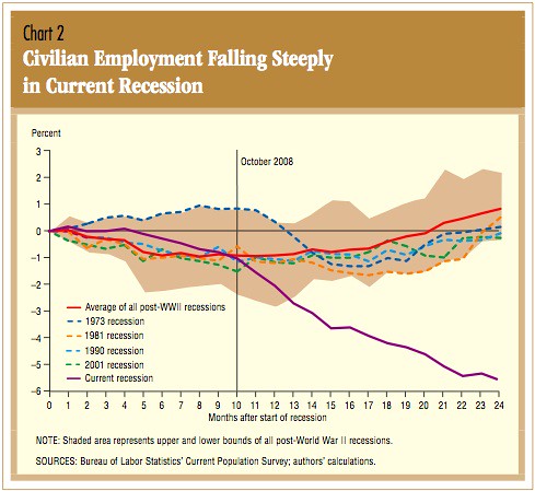
The shaded area in the graph shows the upper and lower bounds of all recessions after World War II. The purple line is the current recession.
And meanwhile in Sacramento, Reno, and Seattle…

5 comments
Skip to comment form
tip jars are common around here Jacob, and they get comments started faster too.. 😉
Good graphic — it speaks well. Well, people can always go in the military — not much problem finding soldiers now.