
re-posted from dailyKos….. I figured I might as well post about what I know about.
Statistical graphics, properly used, let us envision great quantities of information and to have insights into relationships among variables that would be difficult, if not impossible, to get from words and formulas alone. Improperly used, however, they obfuscate or even distort the truth, or waste paper on data that could be better summarized in a table or in text.
Below the fold, I’ll give some principles of graphical design and some types of graphics. Rather than try to import lots of graphics images, I will try to provide links to various graphs.
I then want to invite you, the readers, to put a graph in a comment; it could be a graph you like, a graph you dislike, a graph you don’t understand, or whatever, and then we can discuss each graphic.
You can look at a talk I gave at Yale University, here (pdf file)
My Yale talk
(I admit it. Part of my reason for doing it this way is that I am a bit lazy. But I also think it’s a good way to guarantee that the discussion is useful).
There are a huge number of statistical graphics. Some are beautiful and elegant, conveying great quantities of information. Others are less so. And some are just awful, distorting the data, or simply not presenting it well.
A few people have dominated the field of graphics. The two biggest names are Edward Tufte, who has a website here
Tufte website and William Cleveland, whose homepage is Cleveland homepage. A third person who is less well-known but deserves more recognition is Michael Friendly, whose site is here Friendly homepage
Tufte deals with the general presentation of information; Cleveland is more focused on statistics per se. Tufte bases his rules on his formidable intuition, Cleveland has done some actual experiments on graphical perception. Friendly and Cleveland both offer programs to create the graphs they recommend, which makes them very valuable to data analysts, like me.
OK, enought chitchat. Here are some principles of graphical design, taken from here and there, esp. the works of Tufte and Cleveland; go buy their books!. A good graph will
1. Show the data
2. Induce the reader to think about the substance
3. Not distort the data
4. Present many numbers in a small space
5. Make large data sets coherent
6. Encourage the eye to look at different parts of the data
7. Reveal the data at several levels of detail
8. Serve a clear purpose
9. Engender a clear vision of the data
10. Help the viewer understand the data
Next, some of my own observations:
Before deciding on a graph, we should think about how many variables are involved, and whether they are continuous or categorical.
If there is one variable and it is categorical, then one common choice is a Pie Chart. Avoid them. They often distort the data; if you see one, view it with suspicion. Experiments have shown that a) People are very bad at judging angles and b) Rotating the pie changes people’s perceptions, as does choice of color. A much better choice is the dot chart (The actual dot chart is fairly far down the page, the site is worth a look as a whole). But if there are only a few categories, a table or text may be better.
If there is one variable, and it is continuous, a very common choice is the Histogram; here is what William Cleveland says about histograms:
The histogram is a widely used graphical method that is at least a century old. But maturity and ubiquity do not guarantee the efficacy of a tool. The histogram is a poor method for comparing groups of univariate measurement
one relatively straightforward better choice is the box plot. Another good choice is the density plot (see my Yale talk).
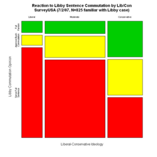
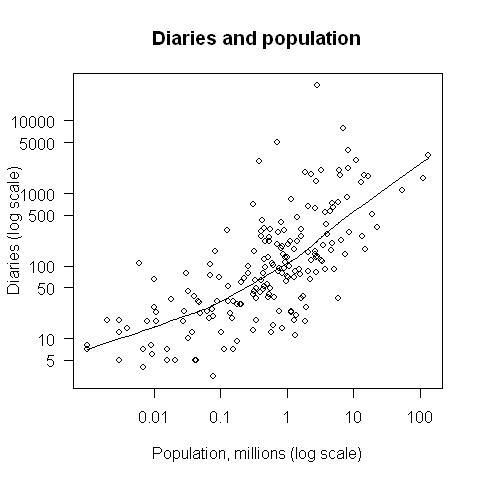
If you have two variables, and they are both categorical a good choice is the mosaic plot (see Michael Friendly’s website, or here), if there is one continuous and one categorical you can use side-by-side boxplots (see my Yale talk). If both are continuous, the traditional choice is the scatterplot but this can be improved (see my talk again, or see this.
OK, this is long enough. Now, it’s your turn!
11 comments
Skip to comment form
Author
I’ll be up for a little while, and back tomorrow morning….
Thanks for sharing it. It’s going right into the reference folder!
Author
this was part of a series of about 12 diaries
And in fact, may be quite helpful as I complete a work project over the next couple of weeks.
Thanks!
until long after I graduated from college (and I plot data in my work).
My son learned about them last year in his 7th grade math class.
That’s bull. You can prve anything misusing statistics.
Thanks plf